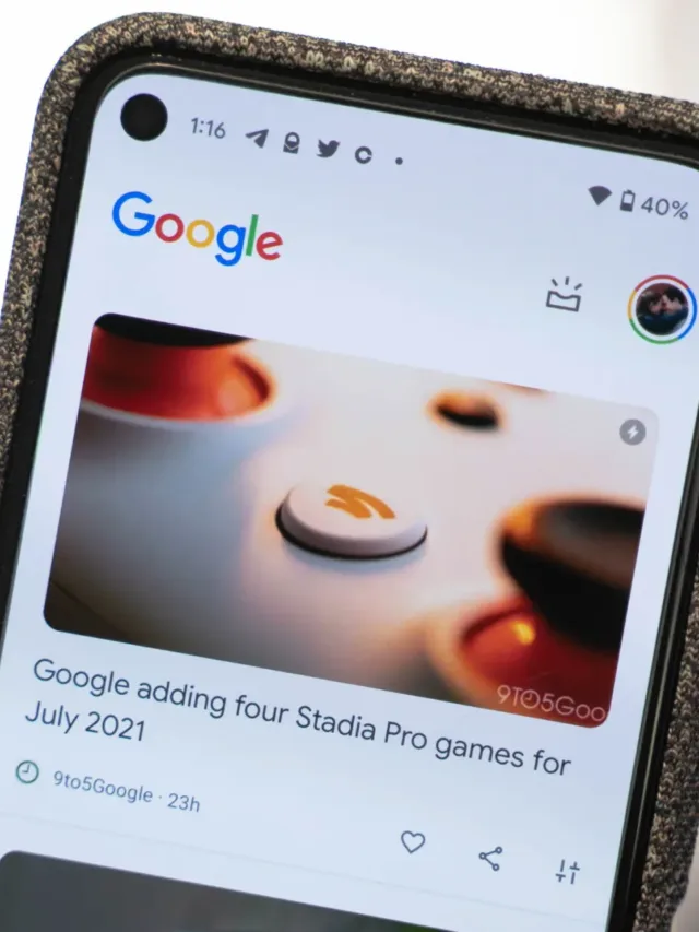
Discover feed, which is accessed through the Pixel Launcher on Pixel phones, has recently been updated by Google with the Material You Look. The user experience on Android devices is always being improved by Google, and with the release of Android 12, they have unveiled a ground-breaking design idea dubbed Material You. With the help of this dynamic theming feature, the entire operating system may be given a unified, aesthetically pleasing look by using the colours from your wallpaper.
Also Read: Exploring the Latest Updates in Android 14 Beta 3.1: Bug Fixes
The Evolution of Google Discover
With the ability to deliver users personalised news, articles, and other pertinent material, Google Discover has become a crucial component of the Android experience. The Discover feed had a fixed layout in the past with few customization possibilities. However, Google is redesigning the Discover feed to provide a more aesthetically pleasing and unified interface with the release of Android 12 and Material You.

Dynamic Theming in the Discover Feed
One of Material You’s most notable features is dynamic theming, which gives the Android operating system a new level of personalisation. The Google logo and the upper portion of the Discover feed were the only places where dynamic theming was previously used. However, Google has now made this feature available across the whole feed, allowing the colours of the wallpaper to be applied to the UI elements and producing a more cohesive and immersive experience.
Themed Elements
The cards in the Discover feed have undergone substantial changes as a result of the Material You makeover. The cards now include the wallpaper colours in addition to the hero photos and video thumbnails. By making this change, the feed will now coordinate with the home screen pages and the Pixel Launcher app list, resulting in a visual flow that is consistent throughout the user experience.
A Streamlined and Colorful Interface
A more streamlined and aesthetically pleasing interface has been added to the Discover feed following a recent update. Previously centre-aligned, the Google logo is now left-aligned in a customised header. A shortcut to launch Assistant Snapshot is placed next to the expanded profile avatar. These changes, together with the dynamic theming, produce an engaging and well-rounded user interface.
Material You Flourishes and Google’s Commitment
The most recent modifications to the Discover feed show Google’s dedication to the Material You design concept. The use of Material You Dynamic Colour, highlighted by the customized header space, and the rounded edges, demonstrate Google’s commitment to offering an aesthetically pleasant and customized experience. Additionally, Material You’s significance in the larger Android ecosystem is highlighted by Google’s inclusion of the service into prominent areas like the Discover feed.
The Future of Dynamic Theming in Android Apps
The addition of dynamic theming to the Discover feed represents a major development for Material You. It is fair to expect the incorporation of dynamic theming in additional Google products and even third-party applications as Google continues to develop and expand this design concept. The ability to offer a visually uniform experience across various apps and user interfaces would significantly improve the Android ecosystem’s overall aesthetic appeal.

User Reception and Longevity of the Material You Redesign
While Android users have expressed excitement about the Material You revamp of the Discover feed, its long-term viability remains to be seen. Google has made design changes in the past that were subsequently undone in response to user input or other factors. Nevertheless, the enthusiastic response and the smooth integration of dynamic theming in the Discover feed imply that this redesign may stick around and end up becoming a cherished aspect of the Android experience.
Embracing Personalization with Material You
Incorporating Material You into the Discover feed is proof of Google’s dedication to customization and user-centred design. Google has developed a visually appealing and cohesive interface that goes beyond the home screen by using the colours from the user’s wallpaper. The Discover feed’s dynamic theming improves both the aesthetic appeal overall and the user experience by making it more personalised and engaging.
Conclusion
The Discover feed’s integration of Google’s Material You overhaul is a key step towards a more aesthetically pleasing and customised Android ecosystem. The Discover feed smoothly merges with the user’s wallpaper thanks to dynamic theming and themed features, producing a unified and engrossing experience. Users may anticipate a more aesthetically pleasing and personalised Android experience across a variety of apps and interfaces as Material You develops and grows. The Discover feed has been updated with Material You, but this is just the start of an exciting journey towards a more individualised and aesthetically beautiful Android ecosystem.
Disclaimer:
AI was used to conduct research and help write parts of the article. We primarily use the Gemini model developed by Google AI. While AI-assisted in creating this content, it was reviewed and edited by a human editor to ensure accuracy, clarity, and adherence to Google's webmaster guidelines.


